How to create Stacked Column chart?
The stack bar chart is the grouped version of simple column chart where contrasting color within a bar shows the part-to-whole relationship or group-by values. It is used to compare many different items and show the composition of each item being compared.
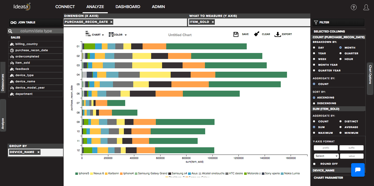
Ideata Analytics provides capabilty to create stacked column chart on analysis screen. The steps to create stacked column chart are as follow:
Step 1: Open the datasource which you want to visualize by clicking on its name on connect screen. It will be redirect to analyze screen
Step 2: You will see the columns listed in the left panel in analyze tab of the selected datasources.
Step 3: On top panel, in chart options select the chart which you want to make from chart list. Here select Stacked column chart.
Step 4: Drag and drop required columns in to rows,columns, color which you want to visualize. Below is its significance -
Dimension(X-axis) - column will be plotted on x axis
What to measure(Y-axis)- by default count of columns will be plotted on y axis
Group-By - data will be grouped by the column and will be shown in different colors
Step 5: Stacked column chart will be created respectively in the chart area which can be saved or exported.