How to select chart parameters?
We can select various data columns of the datasets as the chart parameters by simply selecting the data columns from the left panel in the analysis screen and dragging and dropping it in to measures, dimesion, group by field on the chart area in order to create analysis and reports.
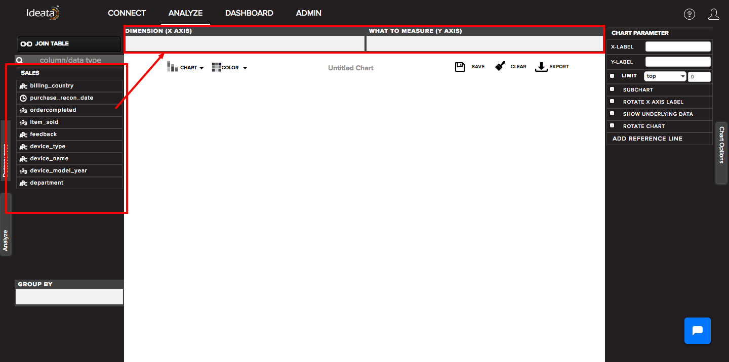
The parameters generally available are:
Dimesion - columns which we want to track and will be shown on x axis
Measures - quantities which we want to measure and will be shown on y axis
Group by - quantites by which we want to group the chart data and will be shown by different colors on the chart
Size - quantites by which we want to define the size of the bubble or treemap square
Color - color by which we want to group the chart
Latitude and Longitude - will be used to draw points on world map
The various paramters available depends upon the selected chart types as below -
| chart type | dimesion (x -axis) | what to measure (y-axis) | group by | size | color |
|---|---|---|---|---|---|
| bar | Y | Y | Y | ||
| stacked bar | Y | Y | Y | ||
| column | Y | Y | Y | ||
| stacked column | Y | Y | Y | ||
| mixed | Y | Y | |||
| donut | Y (TITLE) | ||||
| pie | Y (TITLE) | ||||
| line | Y | Y | Y | ||
| area | Y | Y | Y | ||
| scatter | Y | Y | Y | ||
| step | Y | Y | Y | ||
| spline | Y | Y | Y | ||
| funnel | Y | Y | |||
| pyramid | Y | Y | |||
| tree map | Y | Y | Y | ||
| world map | Y(LALTITUDE) | Y(LONGITUDE) | |||
| bubble | Y | Y | Y | ||
| table view | Y | Y | Y | ||
| word cloud | Y | Y | Y |