How to create line chart?
A line chart reveals trends or progress over time and can be used to show many different categories of data. The line chart is represented by a series of datapoints connected with a straight line.
Line charts are most often used to visualize data that changes over time and one should use it with continuous data set.
Ideata Analytics provides capabilty to create line chart on analysis screen. The steps to create line chart are as follow:
Step 1: Open the datasource which you want to visualize by clicking on its name on connect screen. It will be redirect to analyze screen
Step 2: You will see the columns listed in the left panel in analyze tab of the selected datasources.
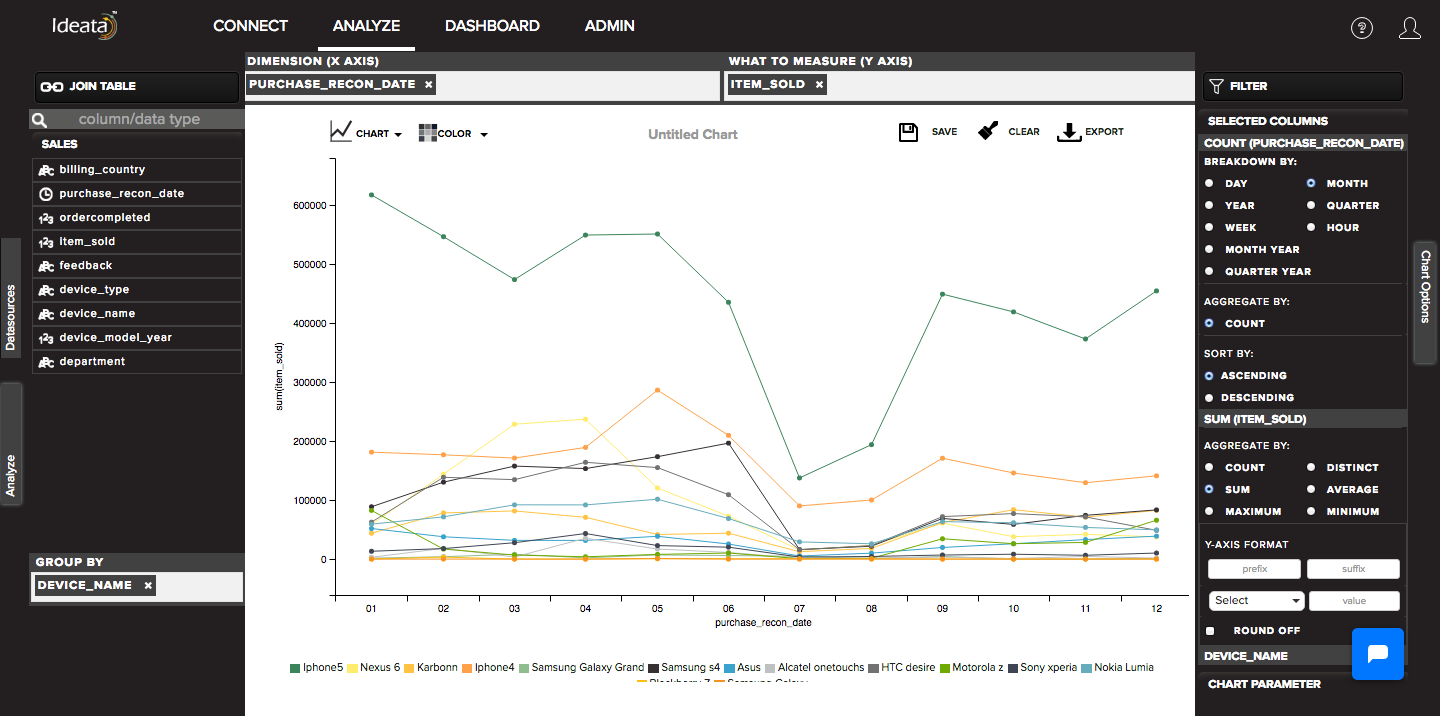
Step 3: In top panel, in chart options select the chart which you want to make from chart list. Here select Line chart.
Step 4: Drag and drop required columns in to rows,columns, color which you want to visualize. Below is its significance -
Dimension(X-axis) - column will be plotted on x axis
What to measure(Y-axis) - by default count of columns will be plotted on y axis
Group-By - data will be group by the column and will be shown in different colors
Step 5: Line chart will be created respectively in the chart area which can be saved or exported.