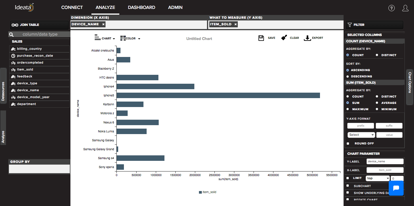
How to create Columnar chart?
A column chart displays data as horizantal bars. It is used to show a comparison among different items, or it can show a distinct values of Y for each items on X axis
Ideata Analytics provides capabilty to create column chart on analysis screen. The steps to create column chart are as follow:
Step 1: Open the datasource which you want to visualize by clicking on its name on connect screen. It will be redirect to analyze screen
Step 2: You will see the columns listed in the left panel in analyze tab of the selected datasources.
Step 3: On top panel, in chart options select the chart which you want to make from chart list. Here select column chart.
Step 4: Drag and drop required columns in to rows,columns, color which you want to visualize. Below is its significance -
Dimension(X-axis) - column will be plotted on x axis
What to measure(Y-axis)- by default count of columns will be plotted on y axis
Group-By - data will be grouped by the column and will be shown in different colors
Step 5: column chart will be created respectively in the chart area which can be saved or exported.