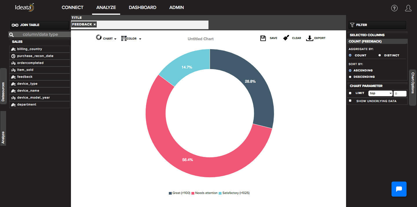
How to create donut chart?
A donut chart is a pie chart with a hole in the center. It is a circular chart divided into sectors which is proportional to the quantity it represents.
Ideata Analytics provides capabilty to create donut chart on analysis screen. The steps to create donut chart are as follow:
Step 1: Open the datasource which you want to visualize by clicking on its name on connect screen. It will be redirect to analyze screen
Step 2: You will see the columns listed in the left panel in analyze tab of the selected datasources.
Step 3: In top panel, in chart options select the chart which you want to make from chart list. Here select Donut chart.
Step 4: Drag and drop required columns in to rows,columns, color which you want to visualize. Below is its significance -
- Title - column will be plotted in a pie with percentage distribution by default
Step 5: Donut chart will be created respectively in the chart area which can be saved or exported.