How to create scatter chart?
A scatter chart plots single point for each datapoint in a series without connecting them. When the user hovers over the points, tooltips are displayed with more information.
A scatter chart will show the relationship between two different variables or it can reveal the distribution trends. It should be used when there are many different data points, and you want to highlight similarities in the data set. This is useful when looking for outliers or for understanding the distribution of your data.
Ideata Analytics provides capabilty to create scatter chart on analysis screen. The steps to create scatter chart are as follow:
Step 1: Open the datasource which you want to visualize by clicking on its name on connect screen. It will be redirect to analyze screen
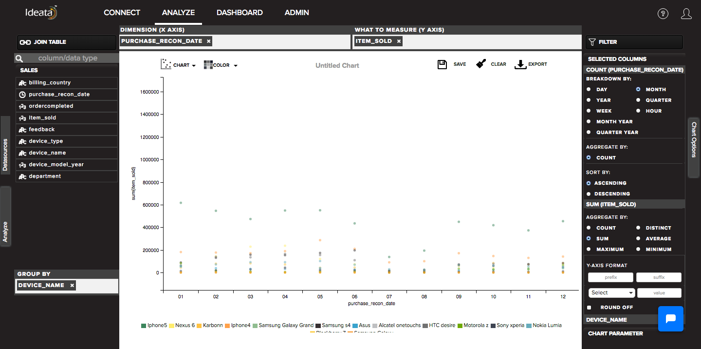
Step 2: You will see the columns listed in the left panel in analyze tab of the selected datasources.
Step 3: In top panel, in chart options select the chart which you want to make from chart list. Here select Scatter chart.
Step 4: Drag and drop required columns in to rows,columns, color which you want to visualize. Below is its significance -
Dimension(X-axis) - column will be plotted on x axis
What to measure(Y-axis) - by default count of columns will be plotted on y axis
Group-By - data will be group by the column and will be shown in different colors
Step 5: Scatter chart will be created respectively in the chart area which can be saved or exported